Created by DaftMaul
This tutorial is an attempt to help you create your own 'pastiche' of the Lucasfilm Ltd logo for the beginning of your fanfilm. Obviously this is a copyrighted, trademarked logo, so don't try doing anything fancy with it, it's only to be used for none profit fanfilms etc., You all know the story.
Anyway, for this 'method' you will need the following programmes.
Adobe Illustrator, Adobe Photoshop and Adobe After Effects (although I'm sure you can acheive similar results from other programmes that you may have) Information about these programmes can be found here.
Becuase of the complex nature of the task, I have assumed some knowledge of using the programmes, this is more of the theory behind creating this.
First the actual logotype itself. This is the hard part, from here on in it should become easier. Begin by getting a screengrab of the Lucasfilm logo to use as a 'template'.
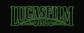
Open up Adobe Illustrator and 'place' the logo on your pasteboard. If you have an illustrator version with layers put this on your base layer. All other work will be done on a different layer.
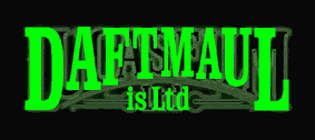
The first thing you need to do is recreate the type. As the Lucasfilm logo is a 'hand rendered' logotype, it's not going to be easy to find an exact match for the typeface. I used Clarendon Condensed (then condensed it some more) to make this overlay. Use the best match you can. So far it's looking pretty ropey, but hopefully it'll get better. Depending on the amount of letters your company name has depends on how close to the original this will look.
You may need to condense the letters considerable to fit them all in. Just remember that they should all line off the top, and they all form a curve around the 'ltd' at the bottom.
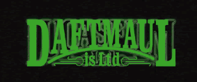
Next it's the curve and' swooshes' at the bottom. Nothing fancy here, but this forms the next part of the logo development.
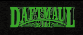
The curve you have just drawn forms the template for the letters to sit on. Adjust the nodes on the bases of all the characters so they form a 'nice' arc along the bottom, echoing the curve you have just drawn. It's now beginning to get somewhere.
Now you need to create the type as outlines. Fill the centre with black and the 'stroke' green you should end up with something like this... The last stage is to round of the corners to give the type a softer feel then its goodbye illustrator and hello photoshop.
I exported the whole thing into Photoshop (this is where using the Adobe packages is great, porting from illustrator to photoshop to after effects is a breeze).
Here are the bones of your new logo, now we've got to flesh it out.
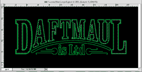
Using the trusty magic wand tool highlight all of the black isoide the type of your logo as shown. Then on the pull down menus choose 'select' and then 'modify' then 'expand' Type in the figure you want to acheive the effect below. I used 30, but my logo was fairly big in size, it depends on how big you want it to go. What you are trying to achieve is an 'outer' that you can fill with black.
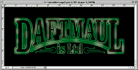
Make a new layer and fill this larger selection with black, once more click on expand and follow the same proceedure. Make another layer and fill that with your green colour. Postition the layers with this new layer on the bottom, on top of which is your black layer, on top of which is your original logo. If you've followed this (which isn't easy) it should now look something like the one above (minus the shading, which comes next).

If you haven't done so already save this file as a .psd, then flatten the file. Using the doge tool lighten areas to give it a '3D' look as above. I also feathered the edges of the 'is Ltd' as this appears softer than the main type.
You now have your 'before' state of your 'Lucasfilm' logo. Now onto the after state...
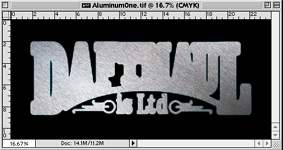
I created a texture called aluminum (supplied at the bottom of this page) and overlayed it onto another layer of the newly created 'before logo' Then again using the trusty magic wand, pick up all of the black APART from the area inside the main letters, invert this selection and then press delete. You should end up with a logo that looks something like this.
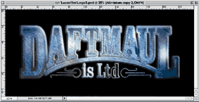
By playing with the lighting (using good old dodge and burn) colours (using colour balance) and using the before version to 'pick up' your masks you should be able to create something that look like this. Save This file as a flattened .psd file, along with your 'before' version. Then its Exit photoshop and Enter After Effects.
Open up a new timeline (I did one that was four seconds) and place your 'before logo' into place. Start with an opacity of zero and after about half a second make it full opacity. Next place your 'after logo' directly on top of your before. Start with this on zero opacity until about two seconds into your timeline, where it will become 100% and cover your 'before' logo. Have it fade out to about 80% briefly (see attached clip, or better still the Lucasfilm logo) and then fade this one out after your four seconds. Now all you need to do is add the sparkles.
I used the Knoll Light Facory LE plug-in to create these, and just applied as many as I felt it needed to finish the job. Hope this helps!


Related Links:
PostProduction Tutorials

